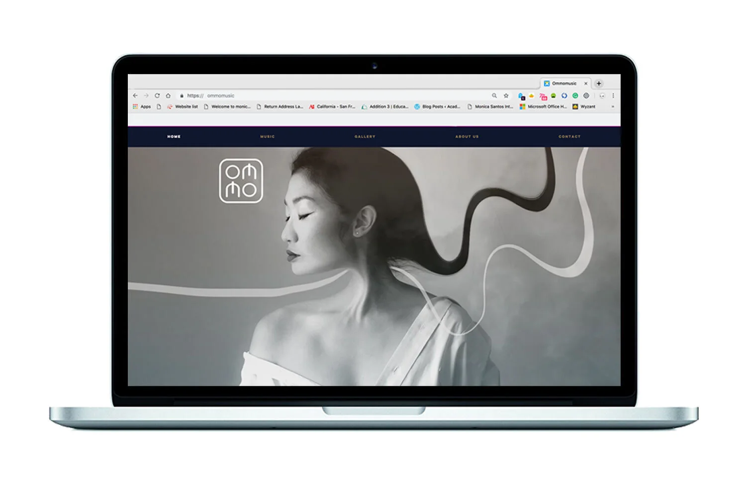
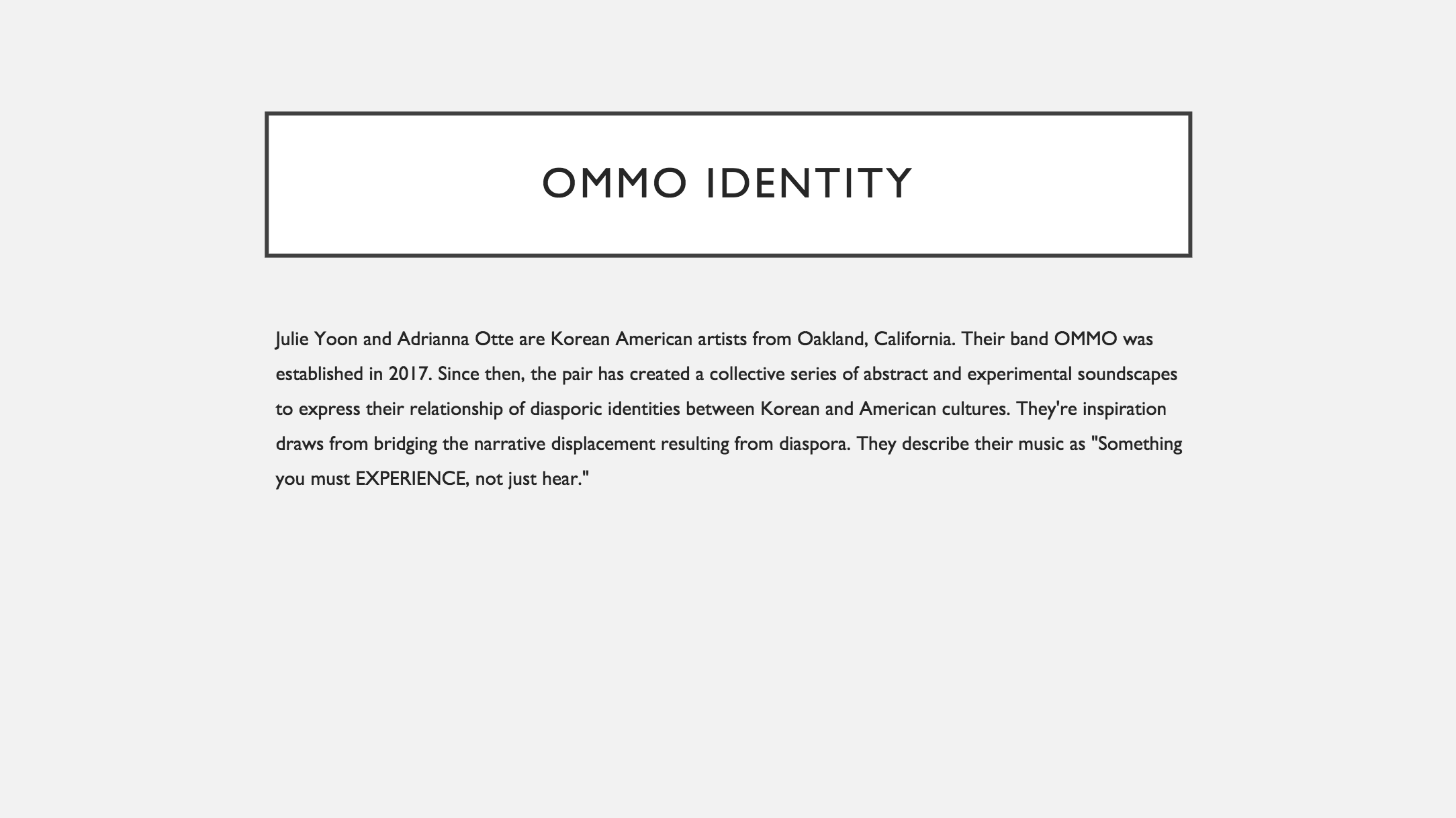
Branding for Ommo Music
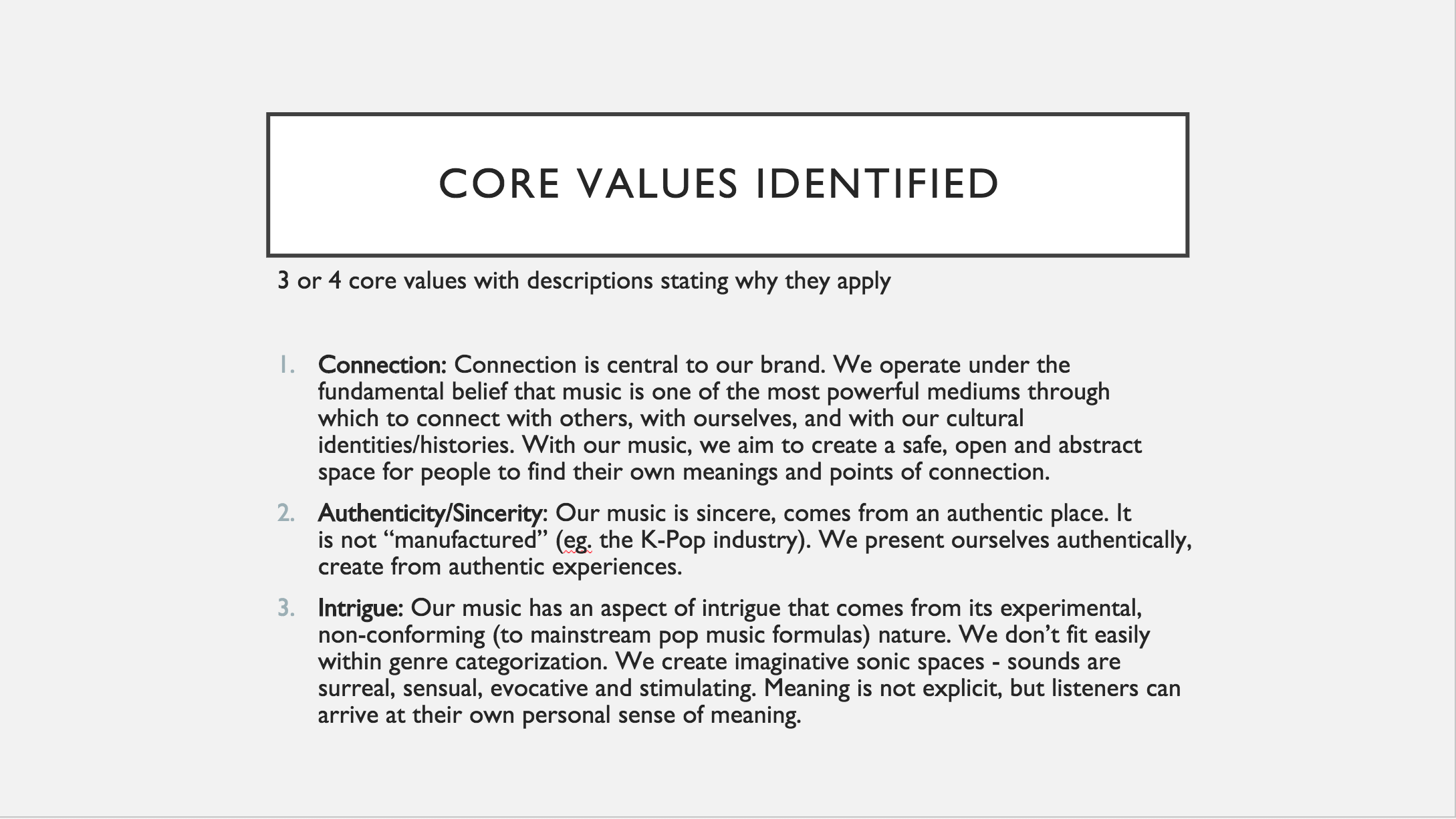
Defined company identity, core values and mission statement
Digital Photography • Image Manipulation • Website Design
Logo Concepts
Create a wordmark for graphic deliverables: album covers, flyers/posters, band photos, other promotional materials
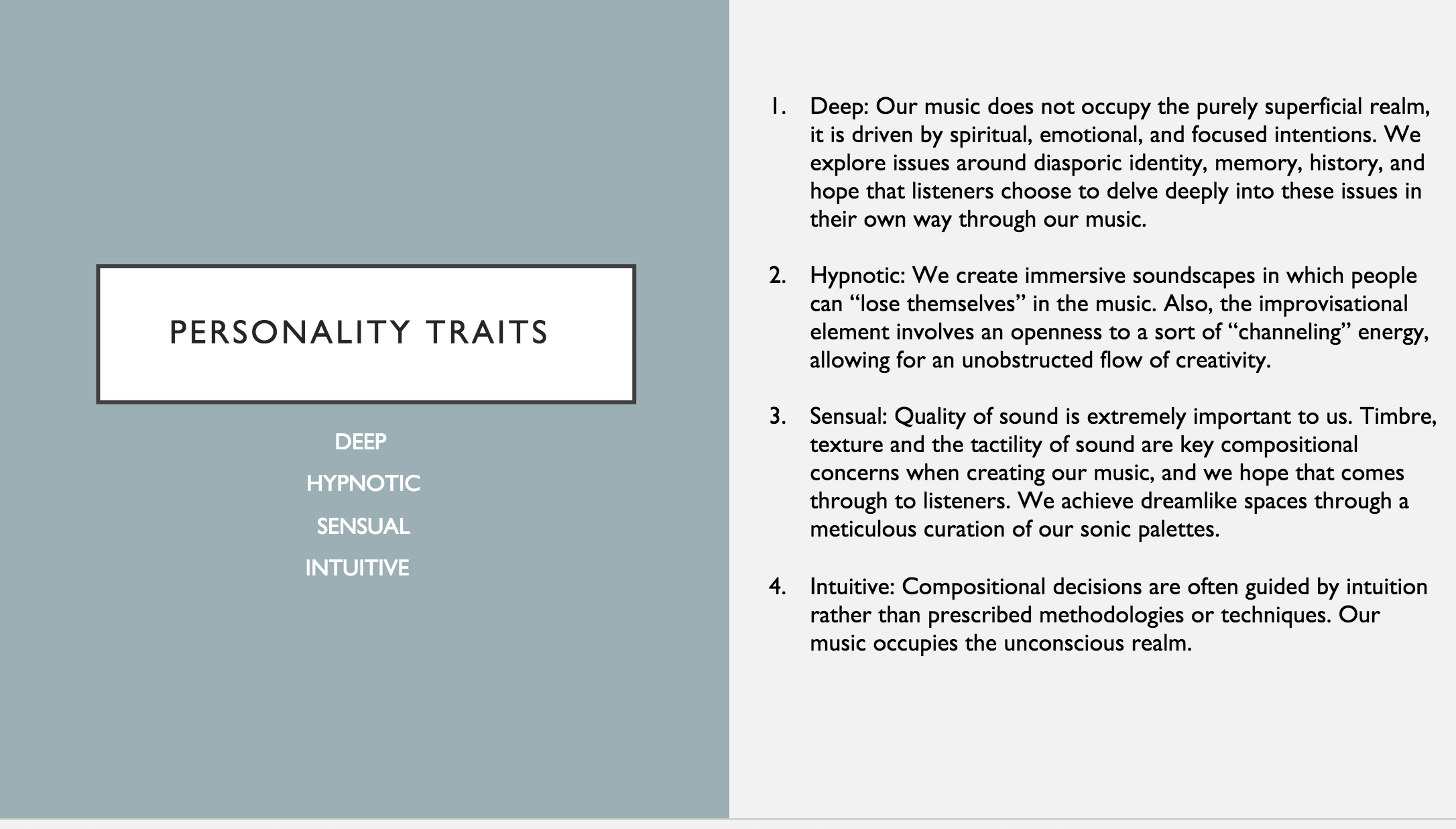
Company colors: off-white & grey and red
Company typefaces: modern, simple clean, korean calligraphy or korean-character inspired fonts
First Draft of Logo Mockups
These concepts showcase vertical designs was inspired by Korean bamboo screens and stamps where poetry, written in calligraphy would be super imposed through relief prints or carvings. Although the vertical shape design was artistic we decided to go with a design that would be easier to read on print as well as translating to different . The skinny vertical design would not read as well on certain applications so we wanted to create a design with a shape that could be used on any cross platform applications
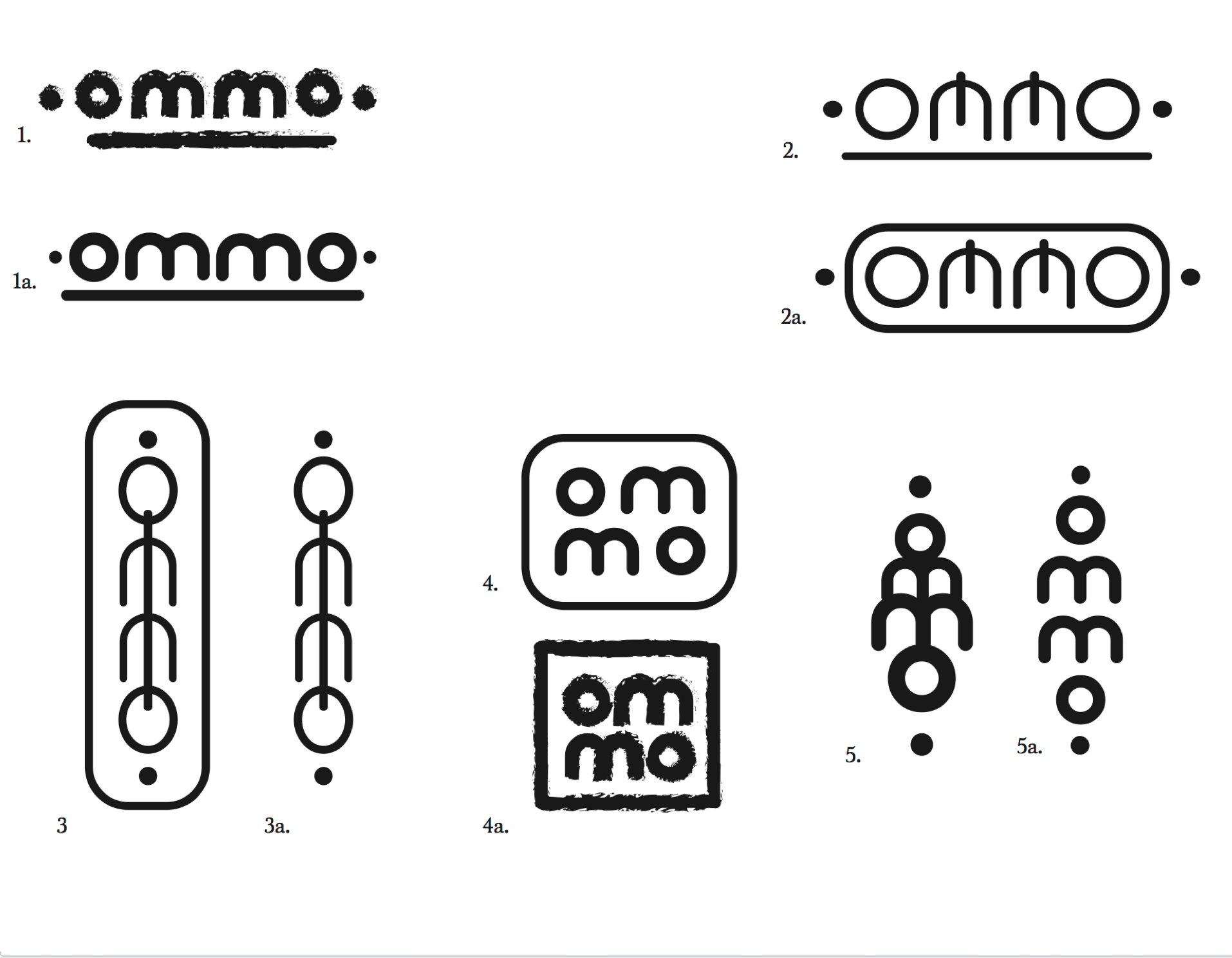
Final Logo
This final version is the medium between there were not enough calligraphy elements involved to reflect the company’s identity, whereas the second version, although was a pleasing design was more difficult to read and use on other forms of media due to its size. The final logo utilizes modern and simple embellishments of Korean calligraphy and has a shape that would be easy to use on any cross platform application such as Instagram, SoundCloud and Facebook.

The final logo utilizes modern and simple embellishments of Korean calligraphy and has a shape that would be easy to use on any cross platform application such as Instagram, SoundCloud and Facebook.
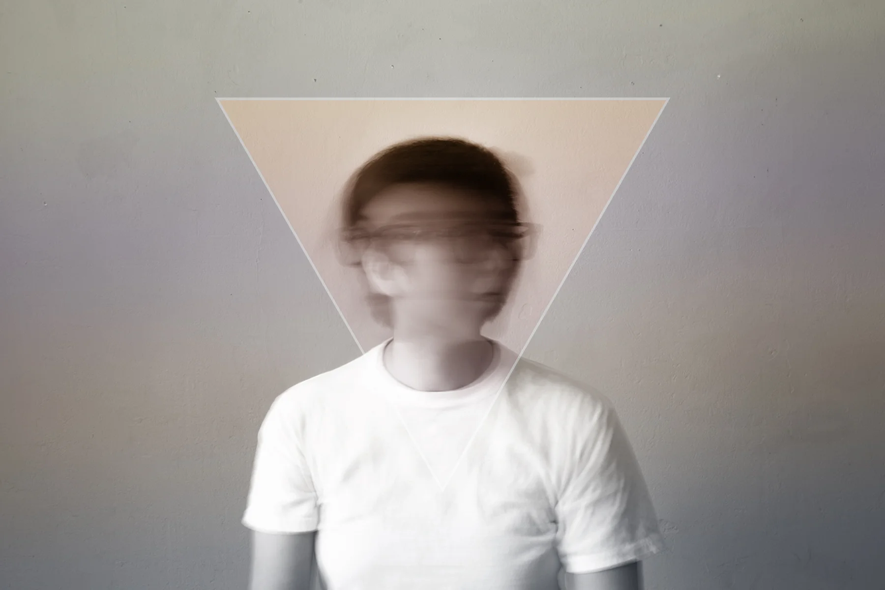
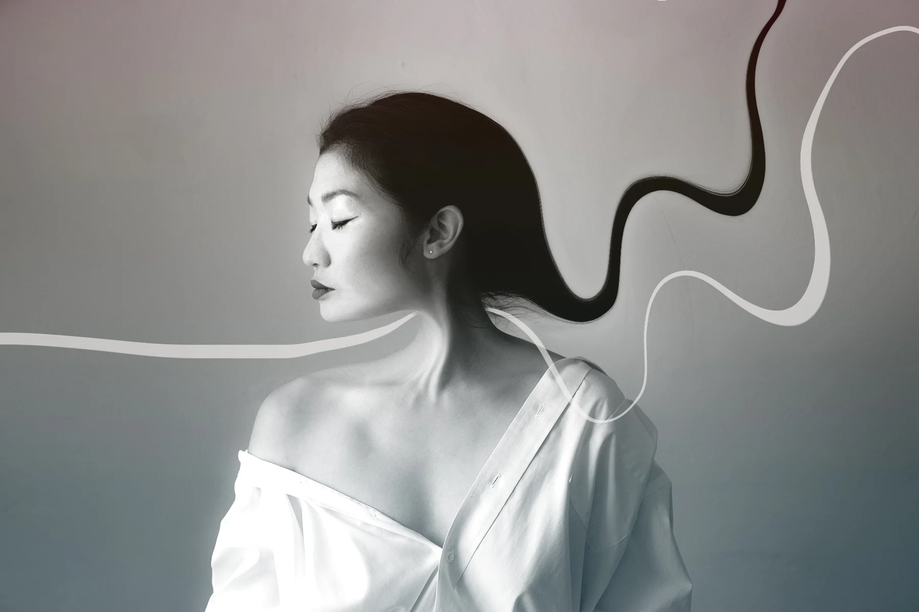
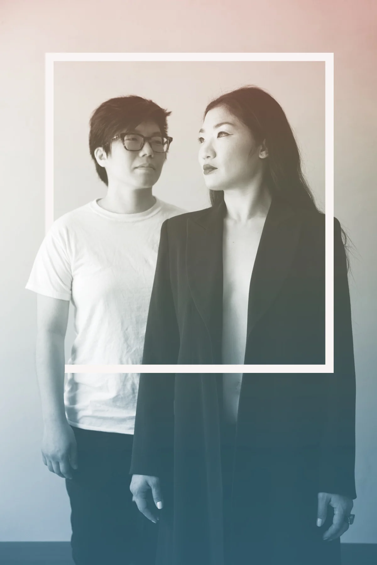
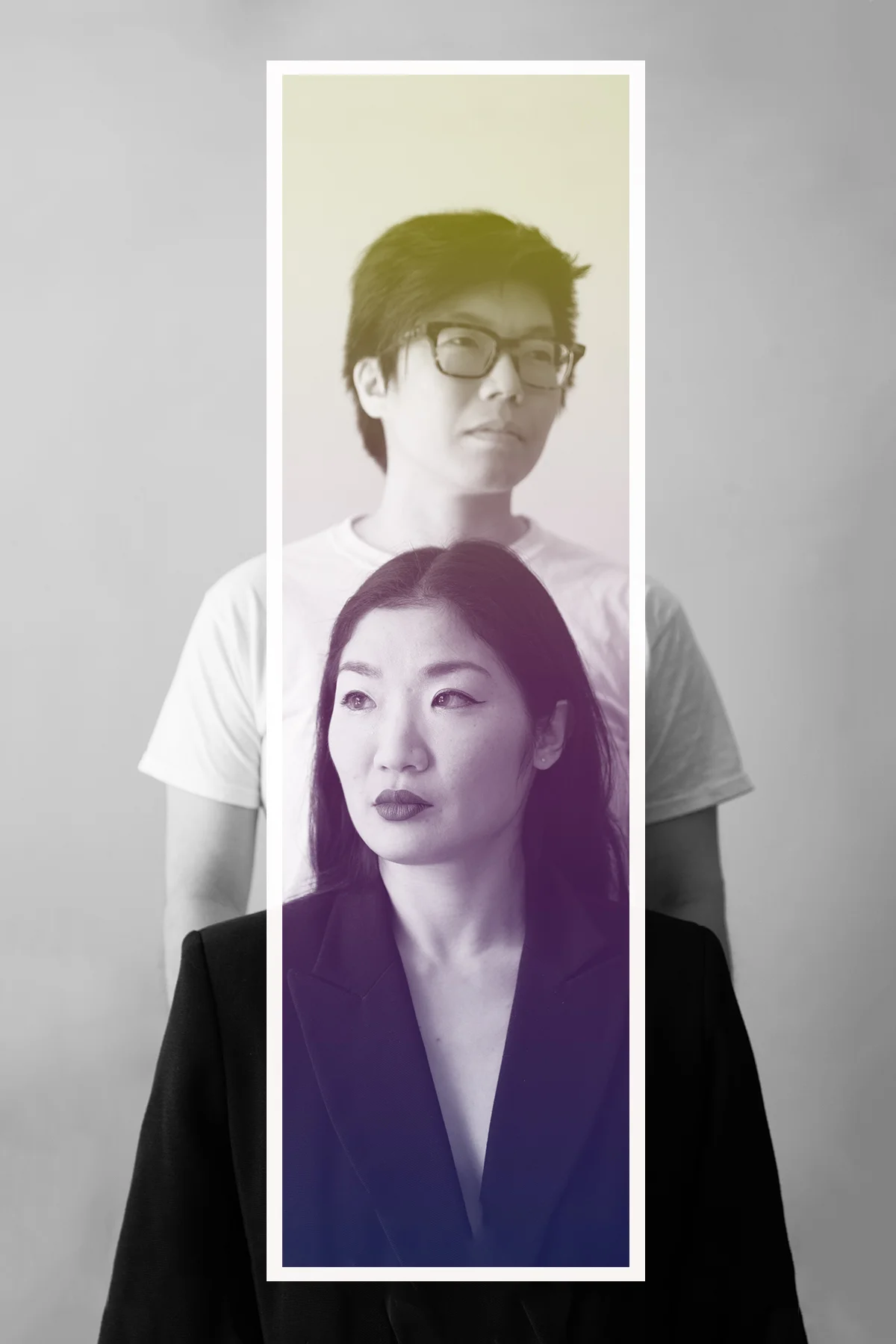

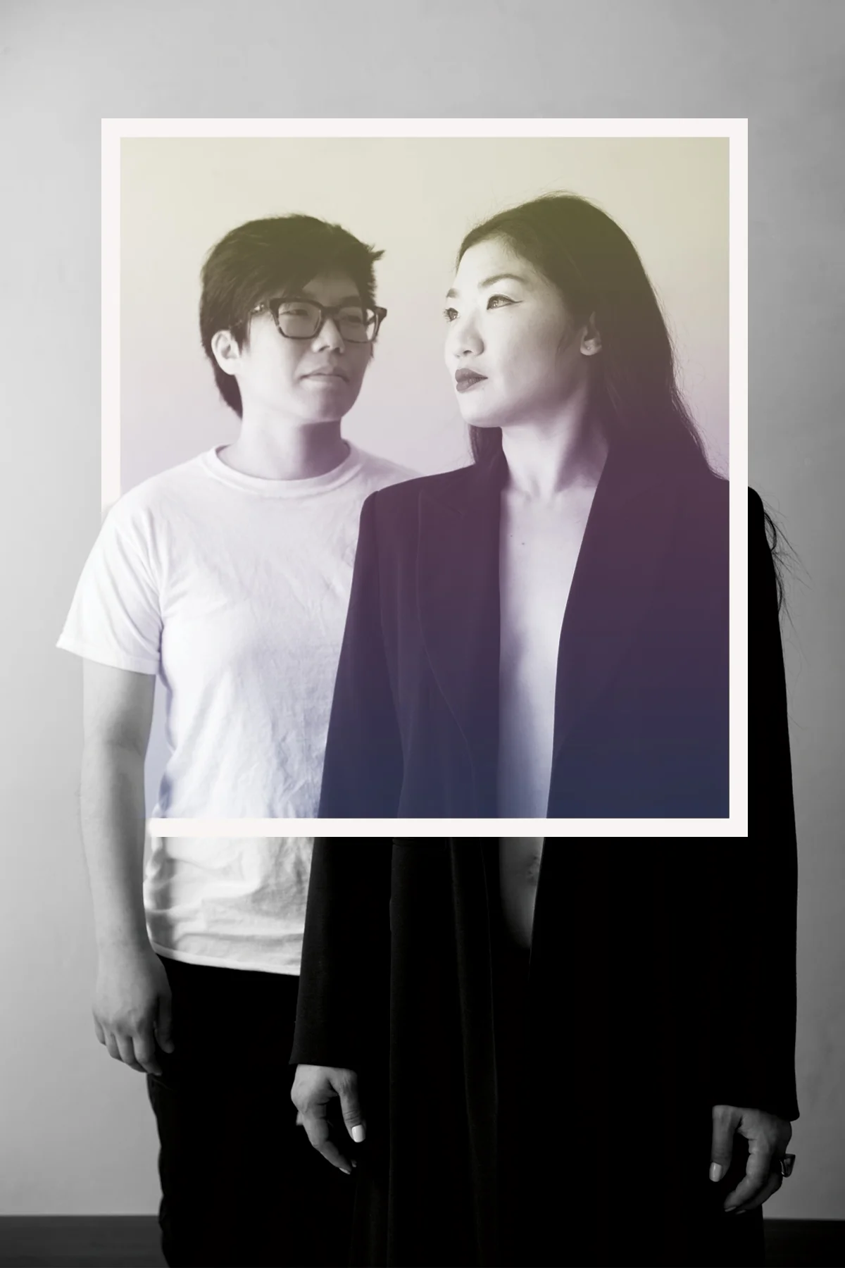
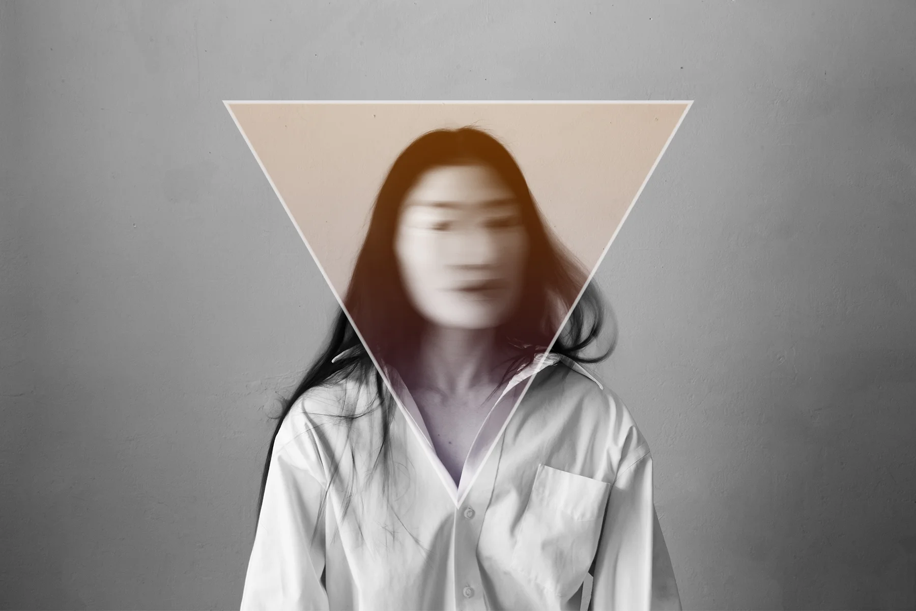
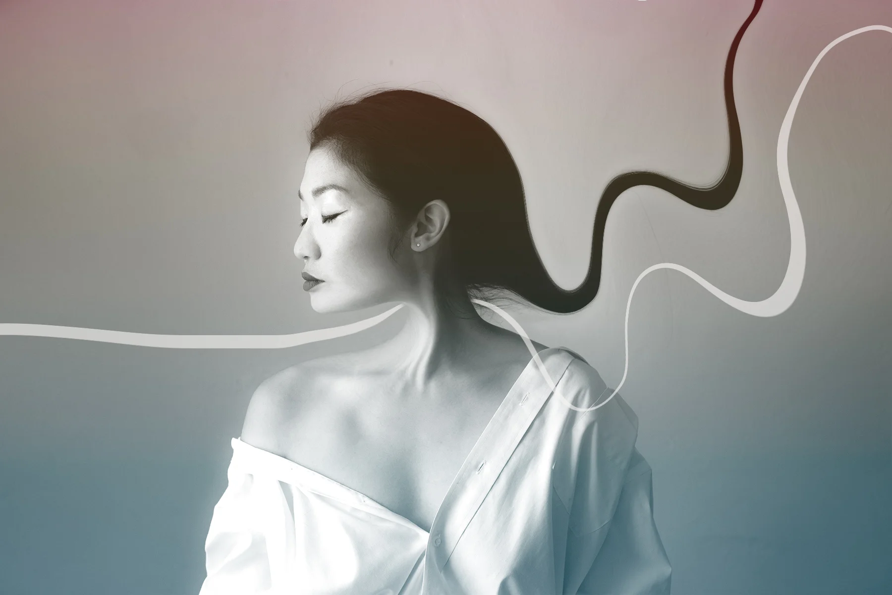
Photographed portraits and created digital manipulated
images for promotional use.
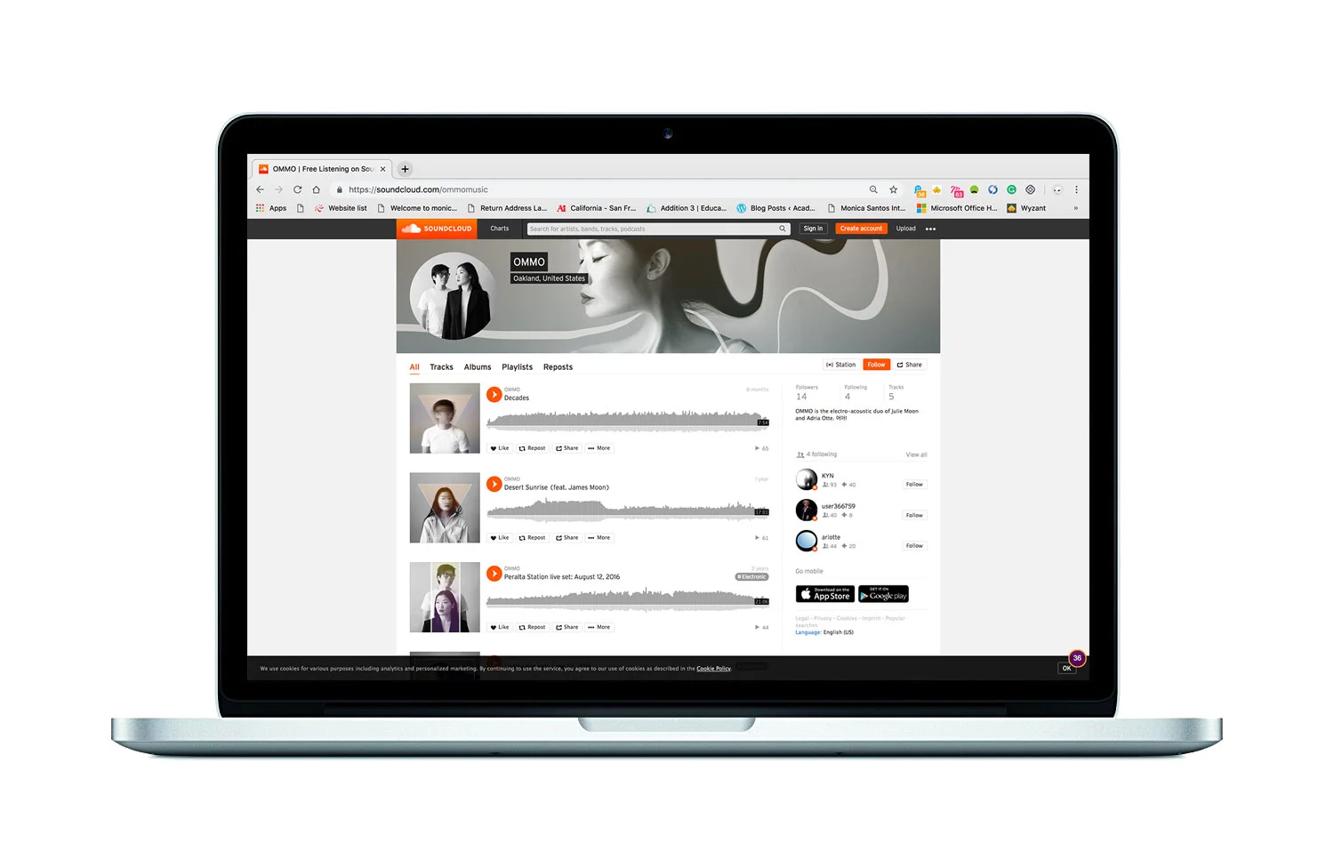
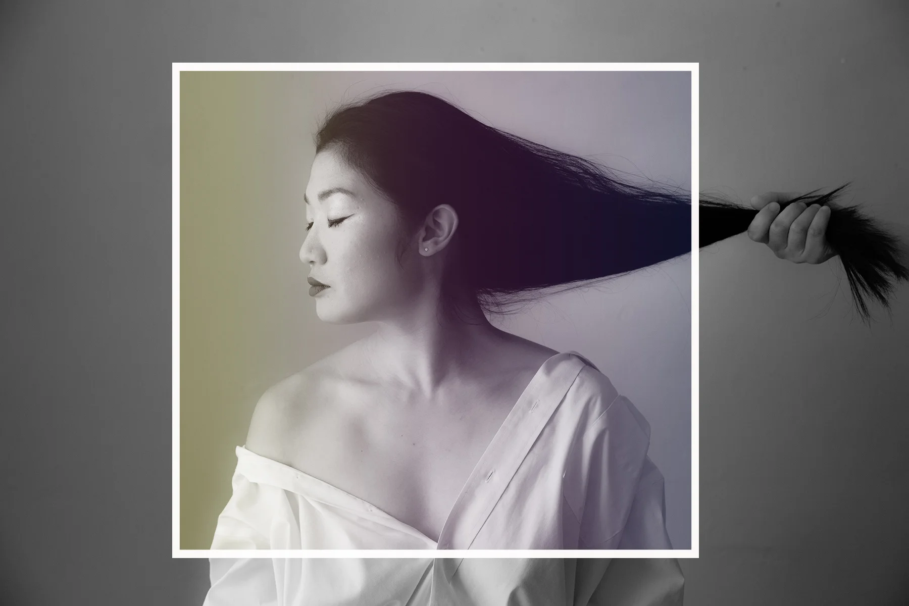
Photo manipulation showcased on Soundcloud Application
